7.8 Exercises - Association and Prediction
Just like in the previous chapters here you will find some exercises that you may want to solve to get from this chapter as much as you can (best option). Alternatively, you may read the task descriptions and the solutions (and try to understand them).
7.8.1 Exercise 1
The RDatasets package mentioned in Section 7.5 contains a lot of interesting data. For instance the Animals data frame.
animals = RD.dataset("MASS", "Animals")
first(animals, 5)
| Species | Body | Brain |
|---|---|---|
| Mountain beaver | 1.35 | 8.1 |
| Cow | 465.0 | 423.0 |
| Grey wolf | 36.33 | 119.5 |
| Goat | 27.66 | 115.0 |
| Guinea pig | 1.04 | 5.5 |
Since this chapter is about association then we are interested to know if body [kg] and brain weights [kg] of the animals are correlated. Let’s take a sneak peak at the data points.
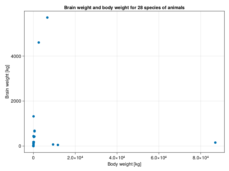
Hmm, at first sight the data looks like a little mess. Most likely because of the large range of data on X- and Y-axis. Moreover, the fact that some animals got large body mass with relatively small brain weight doesn’t help either. Still, my impression is that in general (except for the first three points from the right) greater body weight is associated with a greater brain weight. However, it is quite hard to tell for sure as the points on the left are so close to each other on the scale of X-axis. So, let’s put that to the test.
getCorAndPval(animals.Body, animals.Brain)(-0.005341162561251125, 0.9784802067532018)The Pearson’s correlation coefficient is not able to discern the points and confirm that either. Nevertheless, let’s narrow our ranges by taking logarithms (with log10 function) of the data and look at the scatter plot again.
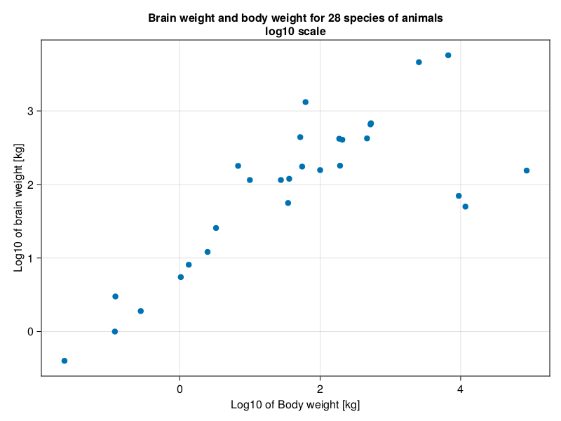
The impression we get is quite different than before. The points are much better separated. The three outliers remain, but they are much closer to the imaginary trend line. Now we would like to express that relationship. One way to do it is with Spearman’s rank correlation coefficient. As the name implies instead of correlating the numbers themselves it correlates their ranks.
Note: It might be a good idea to examine the three outliers and see do they have anything in common. If so, we might want to determine the relationship between X- and Y- variable (even on the original, non-
log10scale) separately for the outliers and the remaining animals. Here, the three outliers are dinosaurs, whereas rest of the animals are mammals. This could explain why the association is different in these two groups of animals.
So here is a warm up task for you.
Write a getSpearmCorAndPval function and run it on animals data frame. To do that first you will need a function getRanks(v::Vector{<:Real})::Vector{<:Float64} that returns the ranks for you like this.
getRanks([500, 100, 1000]) # returns [2.0, 1.0, 3.0]
getRanks([500, 100, 500, 1000]) # returns [2.5, 1.0, 2.5, 4.0]
getRanks([500, 100, 500, 1000, 500]) # returns [3.0, 1.0, 3.0, 5.0, 3.0]
# etc.
Personally, I found Base.findall and Base.sort to be useful while writing getRanks, but feel free to employ whatever constructs you want. Anyway, once you got it, you can apply it to get Spearman’s correlation coefficient (getCorAndPval(getRanks(v1), getRanks(v2))).
Note: In real life to calculate the coefficient you would probably use StatsBase.corspearman.
7.8.2 Exercise 2
P-value multiplicity correction, a classic theme in this book. Let’s revisit it again. Take a look at the following data frame.
Rand.seed!(321)

letters = map(string, 'a':'j')
bogusCors = Dfs.DataFrame(
    Dict(l => Rand.rand(Dsts.Normal(100, 15), 10) for l in letters)
)
bogusCors[1:3, 1:3]
| a | b | c |
|---|---|---|
| 102.04452249090404 | 126.62114430860125 | 72.58784224875757 |
| 81.10997573989799 | 101.02869856127887 | 123.65904493232378 |
| 85.54321961150684 | 109.98477666117208 | 132.32635179854458 |
It contains a random made up data. In total we can calculate binomial(10, 2) = 45 different unique correlations for the 10 columns we got here. Out of them roughly 2-3 (binomial(10, 2) * 0.05 = 2.25) would appear to be valid correlations (\(p \le 0.05\)), but in reality were the false positives (since we know that each column is a random variable obtained from the same distribution). So here is a task for you. Write a function that will return all the possible correlations (coefficients and p-values). Check how many of them are false positives. Apply a multiplicity correction (e.g. Mt.BenjaminiHochberg() we met in Section 5.6) to the p-values and check if the number of false positives drops to zero.
7.8.3 Exercise 3
Sometimes we would like to have a quick visual way to depict all the correlations in one plot to get a general impression of the correlations in the data (and possible patterns present). One way to do this is to use a so called heatmap.
So, here is a task for you. Read the documentation and examples for CairoMakie’s heatmap (or a heatmap from other plotting library) and for the data in bogusCors from the previous section create a graph similar to the one you see below.
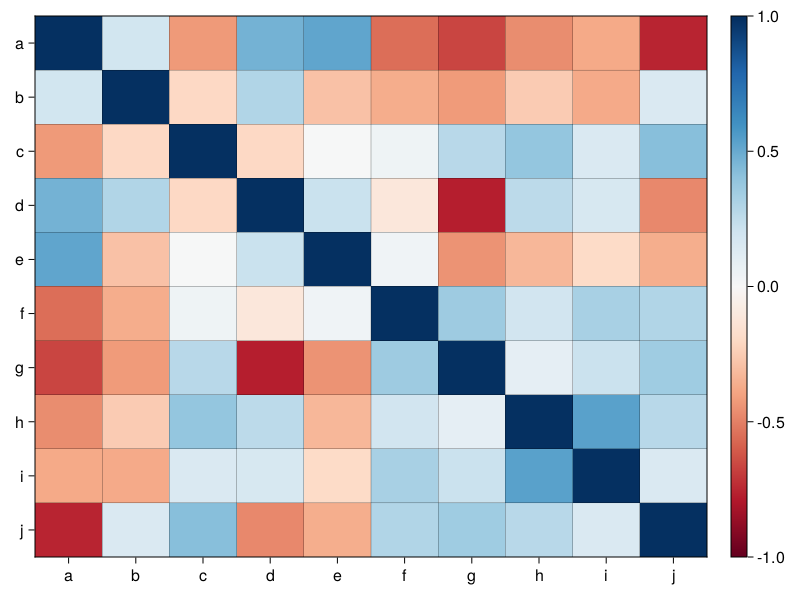
The graph depicts the Pearson’s correlation coefficients for all the possible correlations in bogusCors. Positive correlations are depicted as the shades of blue, negative correlations as the shades of red.
Your figure doesn’t have to be the exact replica of mine, for instance you may choose a different color map.
If you like challenges you may add (write it in the center of a given square) the value of the correlation coefficient (rounded to let’s say 2 decimal digits). Furthermore, you may add a significance marker (e.g. if a ‘raw’ p-value is \(\le 0.05\) put ‘#’ character in a square) for the correlations.
7.8.4 Exercise 4
Linear regression just like other methods mentioned in this book got its assumptions that if possible should be verified. The R programming language got plot.lm function to verify them graphically. The two most important plots (or at least the ones that I understand the best) are scatter-plot of residuals vs. fitted values and Q-Q plot of standardized residuals (see Figure 36 below).
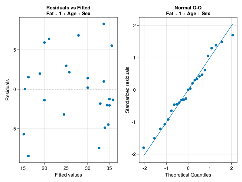
If the assumptions hold, then the points in residuals vs. fitted plot should be randomly scattered around 0 (on Y-axis) with equal spread of points from left to right and no apparent pattern visible. On the other hand, the points in Q-Q plot should lie along the Q-Q line which indicates their normal distribution. To me (I’m not an expert though) the above seem to hold in Figure 36 above. If that was not the case then we should try to correct our model. We might transform one or more variables (for instance by using log10 function we met in Section 7.8.1) or fit a different model. Otherwise, the model we got may give poor predictions. For instance, if our residuals vs. fitted plot displayed a greater spread of points on the right side of X-axis, then most likely our predictions would be more off for large values of explanatory variable(s).
Anyway, your task here is to write a function drawDiagPlot that accepts a linear regression model and returns a graph similar to Figure 36 above (when called with ageFatM1 as an input).
Below you will find some (but not all) of the functions that I found useful while solving this task (feel free to use whatever functions you want):
Glm.predictGlm.residualsstring(Glm.formula(mod))Cmk.qqplot
The rest is up to you.
7.8.5 Exercise 5
While developing the solution to exercise 4 (Section 7.9.4) we pointed out on the flaws of iceMod2. We decided to develop a better model. So, here is a task for you.
Read about constructing formula programmatically using StatsModels package (GLM uses it internally).
Next, given the ice2 data frame below.
Rand.seed!(321)

ice = RD.dataset("Ecdat", "Icecream") # reading fresh data frame
ice2 = ice[2:end, :] # copy of ice data frame
# an attempt to remove autocorrelation from Temp variable
ice2.TempDiff = ice.Temp[2:end] .- ice.Temp[1:(end-1)]

# dummy variables aimed to confuse our new function
ice2.a = Rand.rand(-100:1:100, 29)
ice2.b = Rand.rand(-100:1:100, 29)
ice2.c = Rand.rand(-100:1:100, 29)
ice2.d = Rand.rand(-100:1:100, 29)
ice2
Write a function that returns the minimal adequate model.
# return a minimal adequate (linear) model
function getMinAdeqMod(
    df::Dfs.DataFrame, y::String, xs::Vector{<:String}
    )::Glm.StatsModels.TableRegressionModel
The function accepts a data frame (df), name of the outcome variable (y), and names of the explanatory variables (xs). In its insides the function builds a full additive linear model (y ~ x1 + x2 + ... + etc.). Then, it eliminates an x (predictor variable) with the greatest p-value (only if it is greater than 0.05). The removal process is continued for all xs until only xs with p-values \(\le 0.05\) remain. If none of the xs is impactful it should return the model in the form y ~ 1 (the intercept of this model is equal to Stats.mean(y)). Test it out, e.g. for getMinAdeqMod(ice2, names(ice2)[1], names(ice2)[2:end]) it should return a model in the form Cons ~ Income + Temp + TempDiff.
Hint: You can extract p-values for the coefficients of the model with Glm.coeftable(m).cols[4]. GLM got its own function for constructing model terms (Glm.term). You can add the terms either using + operator or sum function (if you got a vector of terms).