4.6 Normal distribution
Let’s start where we left. We know that a probability distribution is a (possibly graphical) depiction of the values that probability takes for any possible outcome. Probabilities come in different forms and shapes. Additionally one probability distribution can transform into another (or at least into a distribution that resembles another distribution).
Let’s look at a few examples.
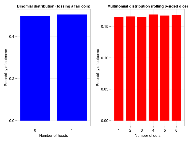
Here we got experimental distributions for tossing a standard fair coin and rolling a six-sided dice. The code for Figure 4 can be found in the code snippets for this chapter and it uses the same functions that we developed previously.
Those are examples of the binomial (bi - two, nomen - name, those two names could be: heads/tails, A/B, or most general success/failure) and multinomial (multi - many, nomen - name, here the names are 1:6) distributions. Moreover, both of them are examples of discrete (probability is calculated for a few distinctive values) and uniform (values are equally likely to be observed) distributions.
Notice that in the Figure 4 (above) rolling one six-sided dice gives us an uniform distribution (each value is equally likely to be observed). However in the previous chapter when tossing two six-sided dice we got the distribution that looks like this.
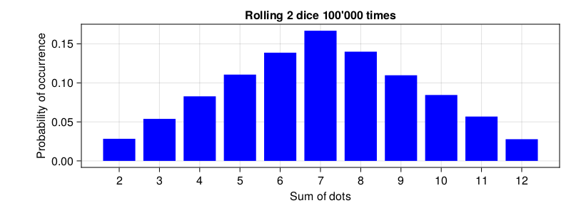
What we got here is a bell shaped distribution (c’mon use your imagination). Here the middle values are the ones most likely to occur. It turns out that quite a few distributions may transform into the distribution that is bell shaped (as an exercise you may want to draw a distribution for the number of heads when tossing 10 fair coins simultaneously). Moreover, many biological phenomena got a bell shaped distribution, e.g. men’s height or the famous intelligence quotient (aka IQ). The theoretical name for it is normal distribution. Placed on a graph it looks like this.
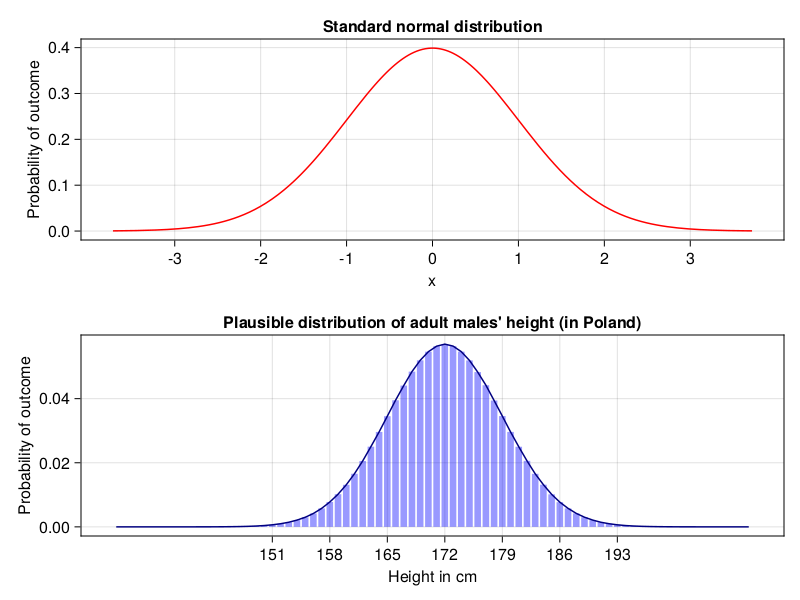
In Figure 6 the upper panel depicts standard normal distributions (\(\mu = 0, \sigma = 1\), explanation in a moment), a theoretical distribution that all statisticians and probably some mathematicians love. The bottom panel shows a distribution that is likely closer to the adult males’ height distribution in my country. Long time ago I read that the average height for an adult man in Poland was 172 [cm] (5.64 [feet]) and the standard deviation was 7 [cm] (2.75 [inch]), hence this plot.
Note: In order to get a real height distribution in a country you should probably visit a web site of the country’s statistics office instead of relying on information like mine.
As you can see normal distribution is often depicted as a line plot. That is because it is a continuous distribution (the values on x axes can take any number from a given range). Take a look at the height. In my old identity card next to the field “Height in cm” stands “181”, but is this really my precise height? What if during a measurement the height was 180.7 or 181.3 and in the ID there could be only height in integers. I would have to round it, right? So based on the identity card information my real height is probably somewhere between 180.5 and 181.49999… . Moreover, it can be any value in between (like 180.6354551…, although in reality a measuring device does not have such a precision). So, in the bottom panel of Figure 6 I rounded theoretical values for height (round(height, digits=0)) obtained from Rand.rand(Dsts.Normal(172, 7), 10_000_000) (Dsts is Distributions package that we will discuss soon enough). Next, I drew bars (using Cmk.barplot that you know), and added a line that goes through the middle of each bar (to make it resemble the figure in the top panel).
As you perhaps noticed, the normal distribution is characterized by two parameters:
- the average (also called the mean) (in a population denoted as: \(\mu\), in a sample as: \(\overline{x}\))
- the standard deviation (in a population denoted as: \(\sigma\), in a sample as: \(s\), \(sd\) or \(std\))
We already know the first one (average) from school and previous chapters (e.g. getAvg from Section 3.6.1). However, the last one (standard deviation) requires some explanation.
Let’s say that there are two students. Here are their grades.
gradesStudA = [3.0, 3.5, 5.0, 4.5, 4.0]
gradesStudB = [6.0, 5.5, 1.5, 1.0, 6.0]
Imagine that we want to send one student to represent our school in a national level competition. Therefore, we want to know who is a better student. So, let’s check their averages.
avgStudA = getAvg(gradesStudA)
avgStudB = getAvg(gradesStudB)
(avgStudA, avgStudB)
(4.0, 4.0)Hmm, they are identical. OK, in that situation let’s see who is more consistent with their scores.
To test the spread of the scores around the mean we will subtract every single score from the mean and take their average (average of the differences).
diffsStudA = gradesStudA .- avgStudA
diffsStudB = gradesStudB .- avgStudB
(getAvg(diffsStudA), getAvg(diffsStudB))
(0.0, 0.0)Note: Here we used the dot operators/functions described in Section 3.6.5
The method is of no use since sum(diffs) is always equal to 0 (and hence the average is 0). See for yourself
(
    diffsStudA,
    diffsStudB
)
([-1.0, -0.5, 1.0, 0.5, 0.0],
[2.0, 1.5, -2.5, -3.0, 2.0])And
(sum(diffsStudA), sum(diffsStudB))(0.0, 0.0)Personally in this situation I would take the average of diffs without looking at the sign of each difference (abs function does that) like so.
absDiffsStudA = abs.(diffsStudA)
absDiffsStudB = abs.(diffsStudB)
(getAvg(absDiffsStudA), getAvg(absDiffsStudB))
(0.6, 2.2)Based on this we would say that student A is more consistent with their grades so he is probably a better student of the two. I would send student A to represent the school during the national level competition. Student B is also good, but choosing him is a gamble. He could shine or embarrass himself (and spot the school’s name) during the competition.
For any reason statisticians decided to get rid of the sign in a different way, i.e. by squaring (\(x^{2} = x * x\)) the diffs. Afterwards they calculated the average of it. This average is named variance. Next, they took square root of it (\(\sqrt{variance}\)) to get rid of the squaring (get the spread of the data in the same scale as the original values, since \(\sqrt{x^2} = x\)). So, they did more or less this
# variance
function getVar(nums::Vector{<:Real})::Real
    avg::Real = getAvg(nums)
    diffs::Vector{<:Real} = nums .- avg
    squaredDiffs::Vector{<:Real} = diffs .^ 2
    return getAvg(squaredDiffs)
end

# standard deviation
function getSd(nums::Vector{<:Real})::Real
    return sqrt(getVar(nums))
end

(getSd(gradesStudA), getSd(gradesStudB))
(0.7071067811865476, 2.258317958127243)Note: In reality the variance and standard deviation for a sample are calculated with slightly different formulas. This is why the numbers returned here may be marginally different from the ones produced by other statistical software. Still, the functions above are easier to understand and give a better feel of the general ideas.
In the end we got similar numbers, reasoning, and conclusions to the ones based on abs function. Both the methods rely on a similar intuition, but we cannot expect to get the same results due to the slightly different methodology. For instance given the diffs: [-2, 3] we get:
- for squaring: \((-2^2 + 3^2)/2 = (4+9)/2 = 13/2 = 6.5\) and \(\sqrt{6.5} = 2.55\)
- for
absvalues: \((-2 + 3)/2 = (2+3)/2 = 5/2 = 2.5\)
Although I like my method better the sd and squaring/square rooting is so deeply fixed into statistics that everyone should know it. Anyway, as you can see the standard deviation is just an average spread of data around the mean. The bigger value for sd the bigger the spread. Of course the opposite is also true.
And now a big question.
Why should we care about the mean (\(\mu\), \(\overline{x}\)) or sd (\(\sigma\), \(s\), \(sd\), \(std\)) anyway?
The answer. For practical reasons that got something to do with the so called three sigma rule.
4.6.1 The three sigma rule
The rule says that (here a simplified version made by me):
- roughly 68% of the results in the population lie within \(\pm\) 1 sd from the mean
- roughly 95% of the results in the population lie within \(\pm\) 2 sd from the mean
- roughly 99% of the results in the population lie within \(\pm\) 3 sd from the mean
Example 1
Have you ever tested your blood and received the lab results that said something like
- RBC: 4.45 [\(10^{6}/\mu L\)] (4.2 - 6.00)
The RBC stands for red blood cell count and the parenthesis contain the reference values (if you are within this normal range then it is a good sign). But where did those reference values come from? This Wikipedia’s page gives us a clue. It reports a value for hematocrit (a fraction/percentage of whole blood that is occupied by red blood cells) to be:
- 45 \(\pm\) 7 (38–52%) for males
- 42 \(\pm\) 5 (37–47%) for females
Look at this \(\pm\) symbol. Have you seen it before? No? Then look at the three sigma rule above.
The reference values were most likely composed in the following way. A large number (let’s say 10’000-30’000) of healthy females gave their blood for testing. Hematocrit value was calculated for all of them. The shape of the distribution was established in a similar way to the one we did before (e.g. plotting with a Cmk function). The average hematocrit was 42 units, the standard deviation was 5 units. The majority of the results (roughly 68%) lie within \(\pm\) 1 sd from the mean. If so, then we got 42 - 5 = 37, and 42 + 5 = 47. And that is how those two values were considered to be the reference values for the population. Most likely the same is true for other reference values you see in your lab results when you test your blood or when you perform other medical examination.
Example 2
Let’s say a person named Peter lives in Poland. Peter approaches the famous IQ test conducted at one of our universities. He read on the internet that there are different intelligence scales used throughout the world. His score is 125. The standard deviation is 24. Is his score high, does it indicate he is gifted (a genius level intellect)? Well, in order to be a genius one has to be in the top 2% of the population with respect to their IQ value. What is the location of Peter’s IQ value in the population.
The score of 125 is just a bit greater than 1 standard deviation above the mean (which in an IQ test is always 100). From Section 4.5 we know that when we add the probabilities for all the possible outcomes we get 1 (so the area under the curve in Figure 6 is equal to 1). Half of the area lies on the left, half of it on the right (\(\frac{1}{2}\) = 0.5). So, a person with IQ = 100 is as intelligent or more intelligent than half the people (\(\frac{1}{2}\) = 0.5 = 50%) in the population. Roughly 68% of the results lies within 1 sd from the mean (half of it below, half of it above). So, from IQ = 100 to IQ = 124 we got (68% / 2 = 34%). By adding 50% (IQ \(\le\) 100) to 34% (100 \(\le\) IQ \(\le\) 124) we get 50% + 34% = 84%. Therefore in our case Peter (with his IQ = 125) is more intelligent than 84% of people in the population (so top 16% of the population). His intelligence is above the average, but it is not enough to label him a genius.
4.6.2 Distributions package
This is all nice and good to know, but in practice it is slow and not precise enough. What if in the previous example the IQ was let’s say 139. What is the percentage of people more intelligent than Peter. In the past that kind of questions were to be answered with satisfactory precision using statistical tables at the end of a textbook. Nowadays it can be quickly answered with a greater exactitude and speed, e.g. with the Distributions package. First let’s define a helper function that is going to tell us how many standard deviations above or below the mean a given value is (it is called z-score)
# how many std. devs is value above or below the mean
function getZScore(value::Real, mean::Real, sd::Real)::Float64
    return (value - mean)/sd
end
OK, now let’s give it a swing. First, something simple IQ = 76, and IQ = 124 (should equal to -1 sd, +1 sd). Alternatively, look at the value returned by getZScore as a value on the x-axis in Figure 6 (top panel).
(getZScore(76, 100, 24), getZScore(124, 100, 24))(-1.0, 1.0)Indeed, it seems to be working as expected, and now the value from this task
zScorePeterIQ139 = getZScore(139, 100, 24)
zScorePeterIQ139
1.625
It is 1.625 sd above the mean. However, we cannot use it directly to estimate the percentage of people above that score because due to the shape of the distribution in Figure 6 the change is not linear: 1 sd ≈ 68%, 2 sd ≈ 95%, 3 sd ≈ 99% (first it changes quickly then it slows down). This is where the Distributions package comes into the picture. Under the hood it uses ‘scary’ mathematical formulas for normal distribution to get us what we want. In our case we use it like this
import Distributions as Dsts

Dsts.cdf(Dsts.Normal(), zScorePeterIQ139)
0.9479187205847805
Here we first create a standard normal distribution with \(\mu\) = 0 and \(\sigma\) = 1 (Dsts.Normal()). Then we sum all the probabilities that are lower than or equal to zScorePeterIQ139 = getZScore(139, 100, 24) = 1.625 standard deviation above the mean with Dsts.cdf. We see that roughly 0.9479 ≈ 95% of people is as intelligent or less intelligent than Peter. Therefore in this case only ≈0.05 or ≈5% of people are more intelligent than him. Alternatively you may say that the probability that a randomly chosen person from that population is more intelligent than Peter is ≈0.05 or ≈5%.
Note:
cdfinDsts.cdfstands for cumulative distribution function. For more information onDsts.cdfsee these docs or forDsts.Normalthose docs.
The above is a classical method and it is useful to know it. Based on the z-score you can check the appropriate percentage/probability for a given value in a table that is usually placed at the end of a statistics textbook. Make sure you understand it since, we are going to use this method, e.g. in the upcoming chapter on a Student’s t-test (see Section 5.2).
Luckily, in the case of the normal distribution we don’t have to calculate the z-score. The package can do that for us, compare
# for better clarity each method is in a separate line
(
    Dsts.cdf(Dsts.Normal(), getZScore(139, 100, 24)),
    Dsts.cdf(Dsts.Normal(100, 24), 139)
)
(0.9479187205847805, 0.9479187205847805)So, in this case you can either calculate the z-score for standard normal distribution with \(\mu\) = 0 and \(\sigma = 1\) or define a normal distribution with a given mean and sd (here Dsts.Normal(100, 24)) and let the Dsts.cdf calculate the z-score (under the hood) and probability (it returns it) for you.
To further consolidate our knowledge. Let’s go with another example. Remember that I’m 181 cm tall. Hmm, I wonder what percentage of men in Poland is taller than me if \(\mu = 172\) [cm] and \(\sigma = 7\) [cm].
1 - Dsts.cdf(Dsts.Normal(172, 7), 181)0.09927139684333097
The Dsts.cdf gives me left side of the curve (the area under the curve for height \(\le\) 181). So in order to get those that are higher than me I subtracted it from 1. It seems that under those assumptions roughly 10% of men in Poland are taller than me (approx. 1 out of 10 men that I encounter is taller than me). I could also say: “the probability that a randomly chosen man from that population is higher than me is ≈0.1 or ≈10%. Alternatively I could have used Dsts.ccdf function which under the hood does 1 - Dsts.cdf(distribution, xCutoffPoint).
OK, and how many men in Poland are exactly as tall as I am? In general that is the job for Dsts.pdf (pdf stands for probability density function, see the docs for Dsts.pdf). It works pretty well for discrete distributions (we talked about them at the beginning of this sub-chapter). For instance theoretical probability of getting 12 while rolling two six-sided dice is
Dsts.pdf(Dsts.Binomial(2, 1/6), 2)0.02777777777777778
Compare it with the empirical probability from Section 4.5 which was equal to 0.0278. Here we treated it as a binomial distribution (success: two sixes (6 + 6 = 12), failure: other result) hence Dsts.Binomial with 2 (number of dice to roll) and 1/6 (probability of getting 6 in a single roll). Then we used Dsts.pdf to get the probability of getting exactly two sixes. More info on Dsts.Binomial can be found here and on Dsts.pdf can be found there.
However there is a problem with using Dsts.pdf for continuous distributions because it can take any of the infinite values within the range. Remember, in theory there is an infinite number of values between 180 and 181 (like 180.1111, 180.12222, etc.). So usually for practical reasons it is recommended not to calculate a probability density function (hence pdf) for a continuous distribution (1 / infinity \(\approx\) 0). Still, remember that the height of 181 [cm] means that the value lies somewhere between 180.5 and 181.49999… . Moreover, we can reliably calculate the probabilities (with Dsts.cdf) for \(\le\) 180.5 and \(\le\) 181.49999… so a good approximation would be
heightDist = Dsts.Normal(172, 7)
# 2 digits after dot because of the assumed precision of a measuring device
Dsts.cdf(heightDist, 181.49) - Dsts.cdf(heightDist, 180.50)
0.024724273314878698
OK. So it seems that roughly 2.5% of adult men in Poland got 181 [cm] in the field “Height” in their identity cards. If there are let’s say 10 million adult men in Poland then roughly 250000.0 (so 250 k) people are approximately my height. Alternatively under those assumptions the probability that a random man from the population is as tall as I am (181 cm in the height field of his identity card) is ≈0.025 or ≈2.5%.
If you are still confused about this method take a look at the figure below.
![Figure 7: Using cdf to calculate proportion of men that are between 170 and 180 [cm] tall (\mu = 172 [cm], \sigma = 7 [cm]).](./images/normDistCdfUsage.png)
Here for better separation I placed the height of men between 170 and 180 [cm]. The method that I used subtracts the area in blue from the area in red (red - blue). That is exactly what I did (but for 181.49 and 180.50 [cm]) when I typed Dsts.cdf(heightDist, 181.49) - Dsts.cdf(heightDist, 180.50) above.
OK, time for the last theoretical sub-chapter in this section. Whenever you’re ready click on the right arrow.